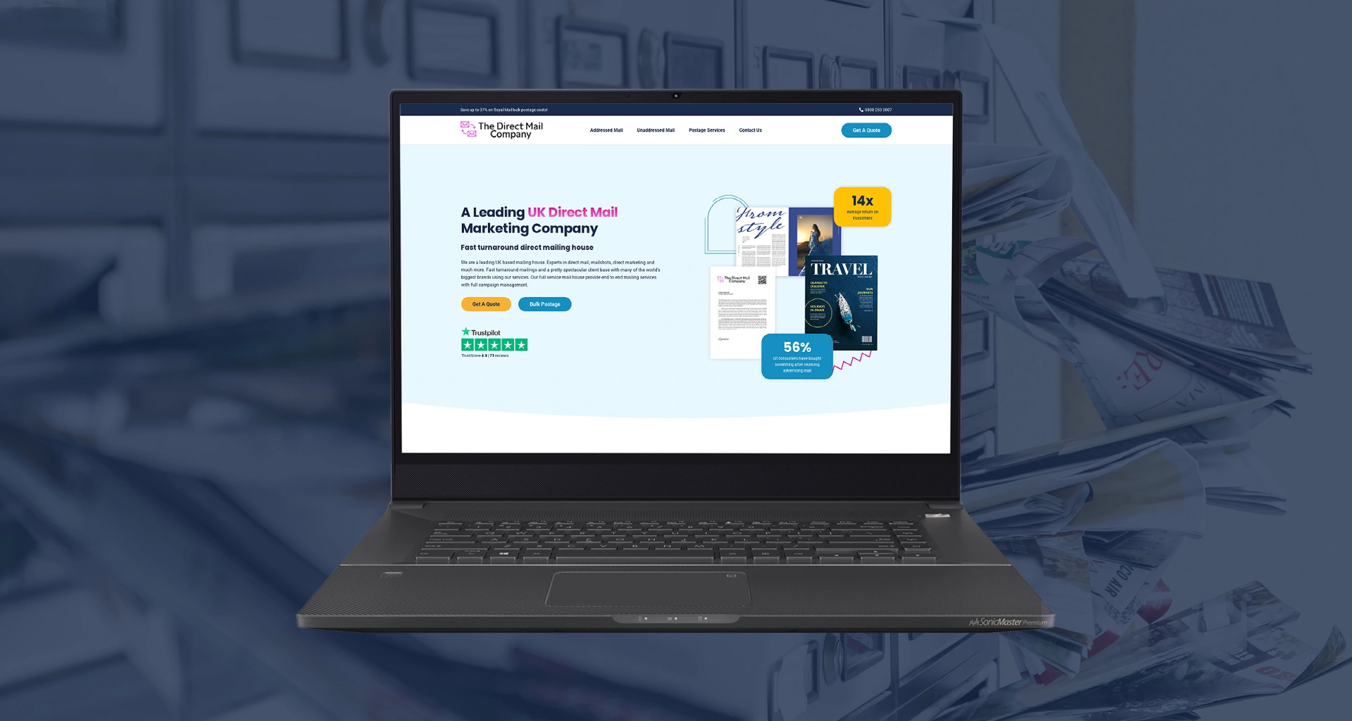
I modernised a direct mail specialist’s website while protecting existing SEO work and improving the journey to an enquiry.
The Direct Mail Company needed its existing website rebuilt with better mobile usability and stronger conversion opportunities. Its broad list of services also made intuitive navigation especially important.
My Solution
I refreshed the visual design with a wider colour palette, graphics and photography to break up text-heavy pages. Clear calls to action now give visitors obvious next steps, while a desktop mega menu makes the company’s many services easier to browse.
Because the previous website had valuable organic rankings, I carefully carried over established content and SEO metadata during the rebuild.
The company reported an increase in lead volume after launch, making this a good example of a redesign that balances visual improvement with commercial priorities.